ARIMA models require some study and application to thoroughly understand. The rewards are well worth it though, if you master ARIMA you’ll have access to a commonly understood data-driven model for time series. ARIMA stands for “autoregressive integrated moving average” – quite a mouthful.
Before we go any further, you should be familiar with the basic measures of variance, and correlations.
Part I – Autocorrelation
Autocorrelation simply examines the correlation between the current value and past values in a time series. So rather than examining the correlation of two distinct variables, we’re digging deeper into a single variable and the relationship between sequential past values and the current value.
There’s some basic notation involved here:
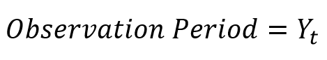
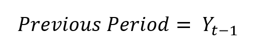
So the subscript t is simply telling us which period the observation is from. If we subtract one from t, “t-1“, we’re looking at the autocorrelation between the observation one period ago and the observation now. We call this autocorrelation of “the first order”. Intuitively, second order autocorrelation would look at “t” and “t-2”.
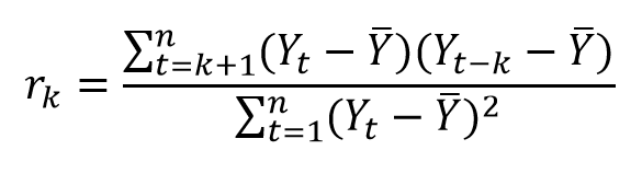
We can convert the equation into terms of “k”, where k is simply the order of the autocorrelation we’re looking at (k=1 would be first order). This is given by yet another user friendly equation:
We’re going to continue to ignore the Greek whenever possible and play with Excel instead.
Example 1:
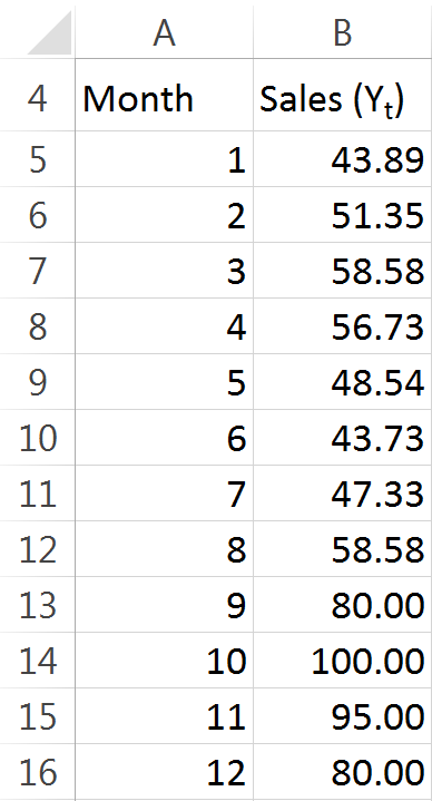
In our hypothetical example we’re going to be examining a time series consisting of monthly sales data. For the sake of keeping things simple to begin with, we’ll use 12 observations of data. Here you have them:
With our data set up, lets take a look back at the equation. Looks like a mess to me. To make it easier to handle, I’ll break it up into pieces. The first step I’ll take is to find the mean of n, all 12 observations. That’s simple enough, right? Just sum up all of the sales:
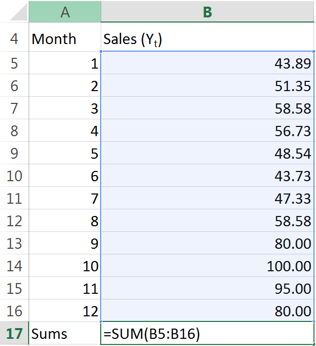
And then we divide the sum by the number of observations (I used COUNT here out of habit – little things like this can help keep models flexible):

So now we have our “mean” terms. Let’s go ahead and deal with this lagged observation business:
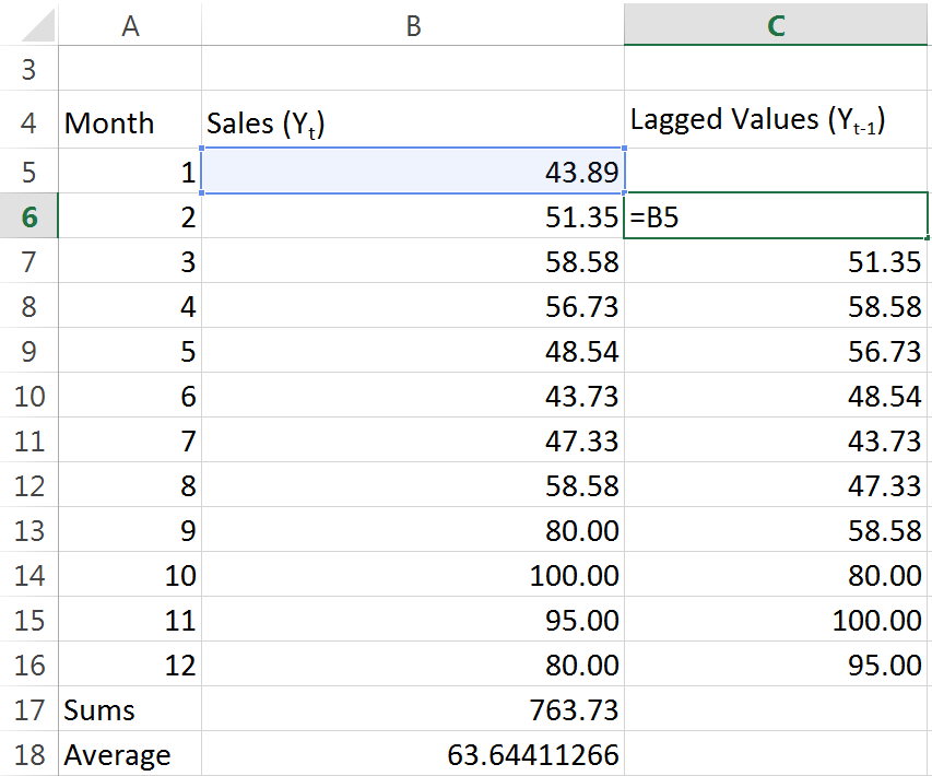
As you can see, it’s really easy to understand what’s going on when we work with the spreadsheet. We just set up a column for lagged values, and we reference the sales data for the prior month. Easy. Next lets go ahead and do some calcualtions. We need to take every single months sales data, and subtract the mean from it:
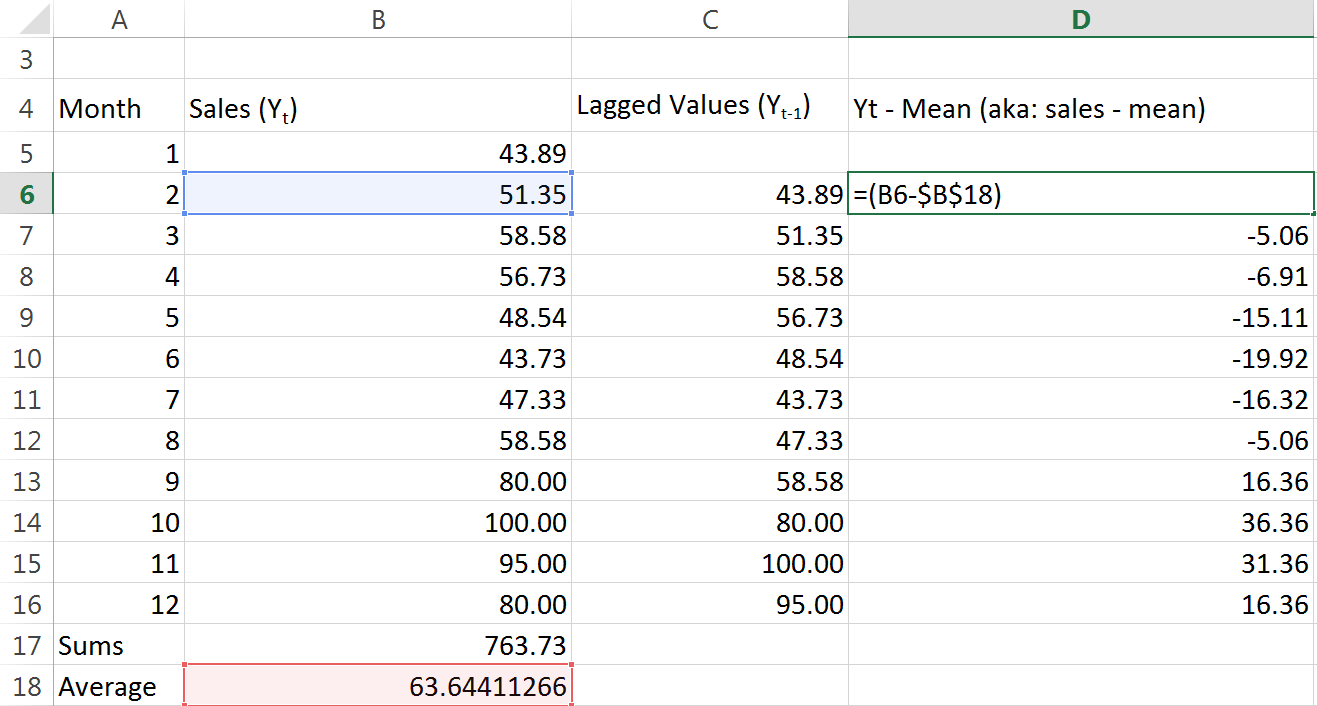
We’re making some progress. Remember to “lock” (absolute cell references with $ dollar signs) the reference to the average. Let’s do the same for the lagged observations:
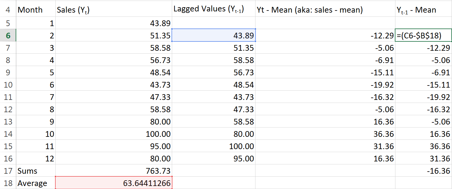
Good. Now for each month we have found both that months sales less the mean, and the previous months sales less the mean. We just need to multiply those two numbers for each month, and then add up all the results:
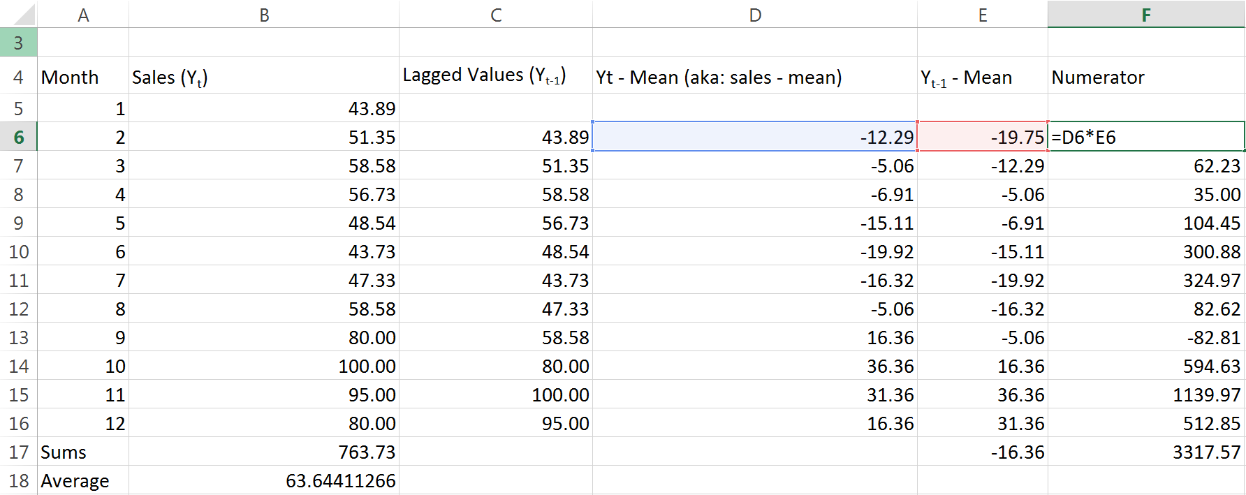
I’m lazily calling this column the “Numerator” because if you go back and examine the equation, that’s exactly what it is. The last number in the Numerator column is taking the sum of the rest of the column. With all that complete, we just need to find the denominator and then divide the two. Guess what I’m going to call the denominator column?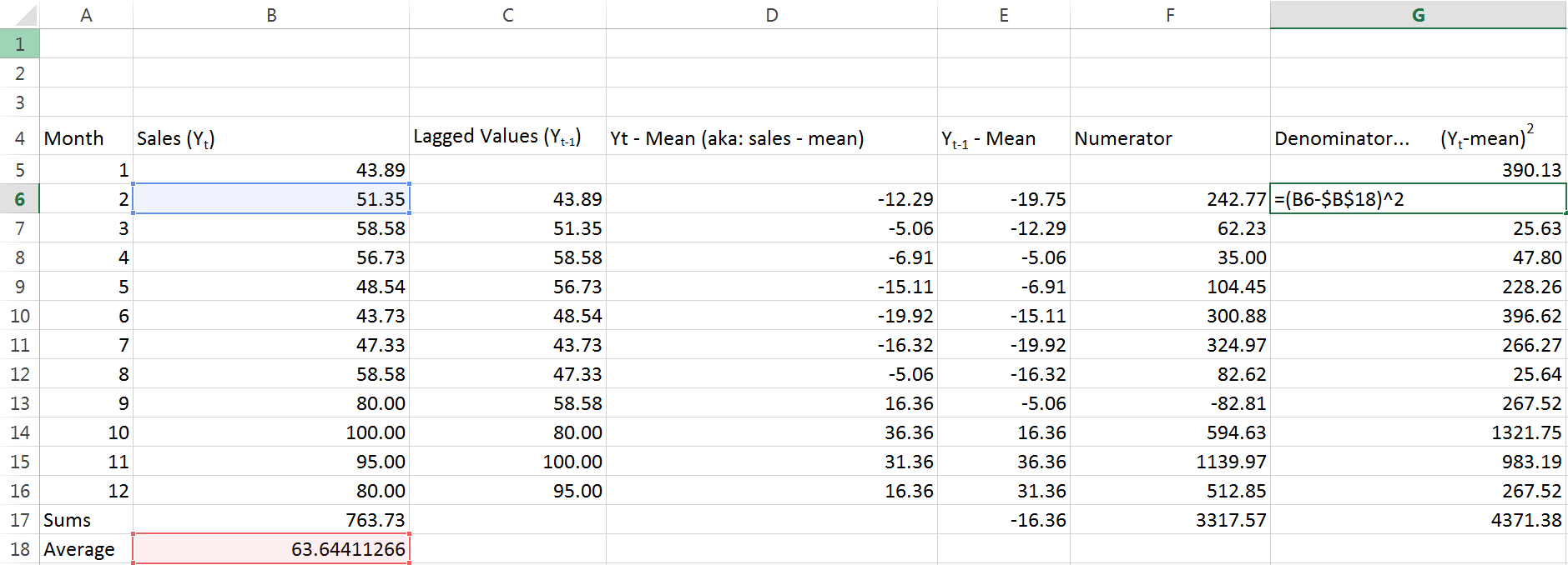
Yeah, you guessed it. Again, the last figure in this column is just adding up everything above it. Look back to the equation we started with – what’s left for us to do?
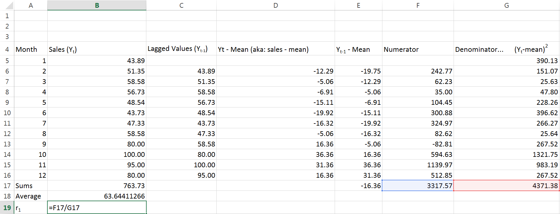
Just divide our “numerator” by our “denominator”. The end result we get is .7589… on and on for a while. Thats a positive number, and it’s pretty close to 1. This tells us we have fairly strong positive autocorrelation. When I first learned about autocorrelation my reaction at around this point was A) that took way too long and B) what is the point?
Cant do anything about A, doing ARIMA models right is worth it though – promise. As for the point, let’s get away from the eyesore that is our series of columns and take a look at a chart.
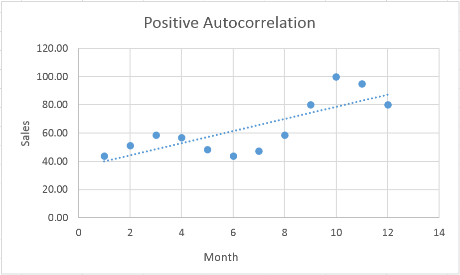
This is just the plot of our original data with a simple linear regression trendline. Notice how the actual observed values (big bold blue dots) sort of worm their way over and under the trendline?
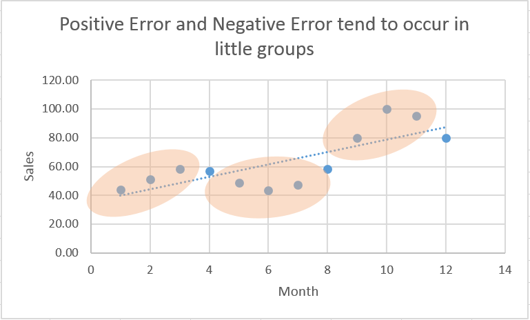
Positive autocorrelation tells us that positive error terms tend to be preceded by and followed by other positive error terms – several in a row. See how observations tend to fall above or below the line, several in a row, before they reverse their error (circled by my odd little tan amoebas). Likewise, negative error terms tend to have other negative error terms before and after them. This is insightful in and of itself (think technical analysis and its concern for momentum stocks) but autocorrelation can also indicate that we’ve chosen an incorrect functional form for our model.
Part II (out later this week) is going to elaborate a little more about autocorrelation, and also take a look at negative autocorrelation.